Shades of Blue in Dutch Delftware
While Dutch Delftware comprises many different colors and styles, it is most commonly known for its characteristic blue and white decoration. Many variations within the simple scheme of blue and white can help date an object and place it within an historical context. While fashion largely dictated the color changes, the varieties of blue in each object were dependent on many different factors that included economics and international influences.
The earliest examples of blue Delftware found inspiration in the colors of Chinese porcelain. The choice for blue was also practical; it was the easiest color to fire onto ceramics because cobalt glazes resist high temperatures. There was little room for error in the firing process, therefore the color was a safe choice for many new factories.
Changing fashions also contributed to the use of blue in Delftware. Throughout the 17th century, there was a cultural shift towards simplicity. Around 1625, bright colors were discarded in fashion, and the upperclass increasingly dressed in darker tones, including black. Dark textiles were a sign of wealth; black was the hardest color to dye onto fabric and therefore the most expensive. The paintings of Rembrandt and Jan van Goyen document this cultural shift. Following on the heels of fashion, decorations for the home changed as well. Moderation in design was found in the monochrome color scheme in tiles, majolica and the newly developed faience from Delft. After 1625, the faience goods for the wealthy were solely decorated in blue, as Van Dam explains in Delffse Porceleyne: “It (blue) was a neutral color, that set off the sober fashions.”[1] While the genteel, urban class was the primary market for objects in blue, brightly colored majolica continued to be very popular in rural parts of Holland, Zeeland, and Friesland.
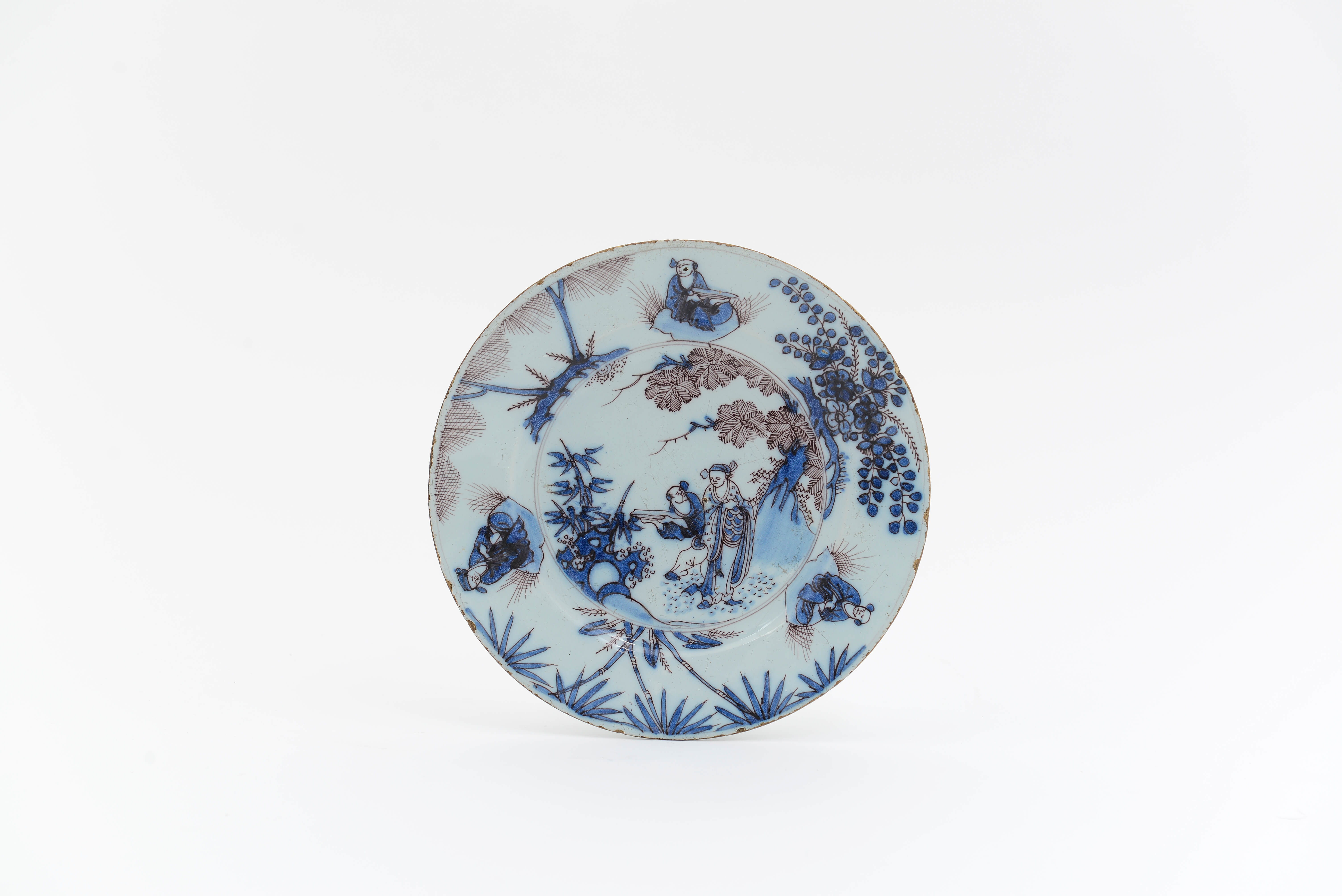
The Delft dishes inspired by the Chinese export wares show a larger variety of blue than the Chinese originals. Together with a strong bright blue are shades of soft violet and grayish tones. The outlines, or ‘trek,’ are traced in dark blue, black, or a slight reddish-purple. Even today, the shade of the blue decoration and the outlines can date a piece of Delftware. A brief global overview of the color variations in blue Delftware with accompanying examples is discussed below.
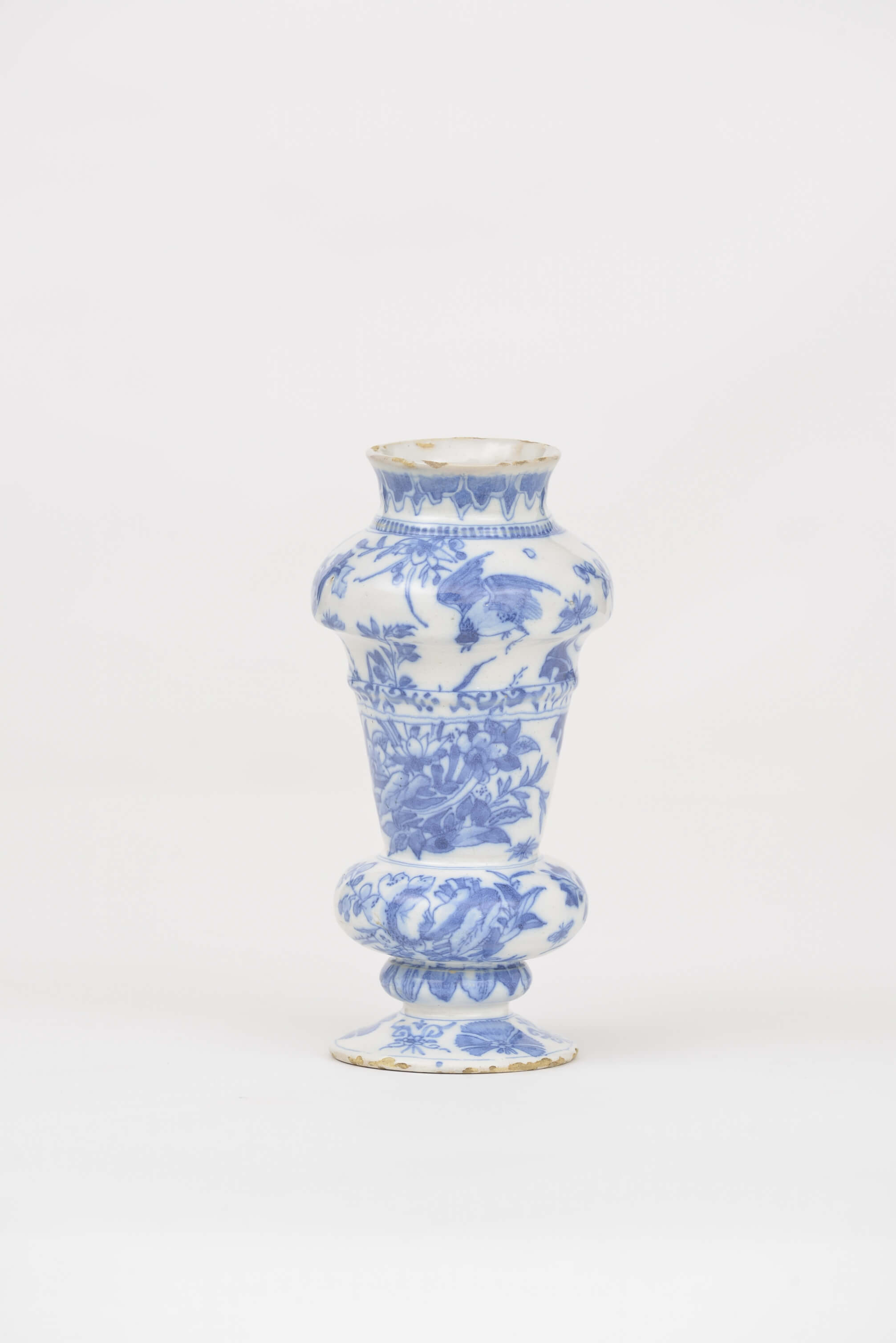
Early Delft dishes, ewers and vases, show a beautiful ton sur ton using a lavender blue palette on a milky white glaze. These objects are often decorated in the style of Chinese Transition porcelain (1644-1662), consisting of scattered little landscapes of figures amongst rock, stylized fern shrubbery, and palm trees. The little double-baluster vase (depicted above) is a nice example of the lavender blue palette on an oriental-shape form, showing flowering thistle-like plants and flying birds.
The pieces that were made under the leadership of Samuel van Eenhoorn at De Grieksche A (The Greek A) factory from 1678-1685 are very recognizable for their unique color scheme. Objects have a slightly grey-green, light blue or bright white glaze. They are painted with bright cobalt blue and strong dark blue-black outlines in combination with areas in soft light blue. Under the guidance of Van Eenhoorn, his painters sometimes used manganese for the outlines around figures, and for small details such as leaves and decoration in clothing. A beautiful example in our collection is a plate, marked SVE, decorated with typical Chinoiserie figures of dignitaries. The decoration demonstrates the careful attention the factory gave to color gradation.
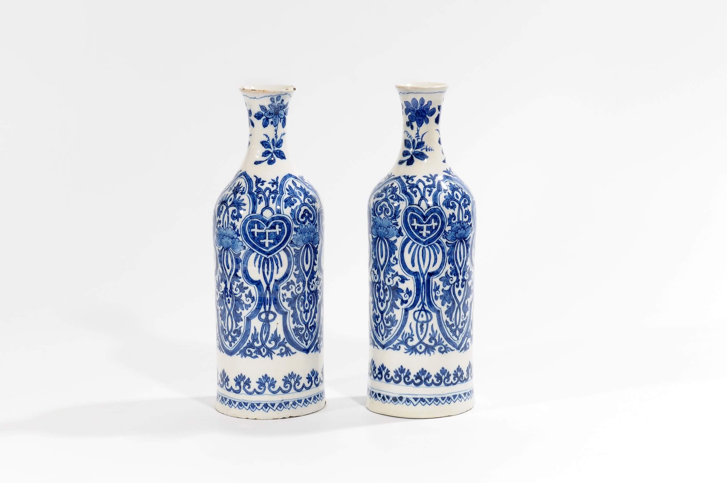
Adriaen Kocx led the De Grieksche A (The Greek A) factory from 1687 [[[1686? RA]]] until 1701. During this period, the factory produced objects in a wide variety of shapes, from small tea canisters to pyramidal flower vases taller than a meter. The characteristic decorative scheme under Kocxs’ supervision consisted of small flowering twigs and birds, and borders of ruyi-heads and teeth rims in soft blue. AK-marked objects are typically decorated with a beautiful milk-white glaze, and painted with brilliant, almost glowing, cobalt blue. This pair of bottle-shaped vases, inspired by Kangxi prototypes, and decorated with heart-shaped panels and elaborate scroll work, is an excellent example of AK-marked objects.
In the first half of the 18th century, several factories adapted their color schemes to the fashionable petit feu colors, or glazes that were fired at a lower temperature. Again, the inspiration came from Chinese porcelain, in the style of wares known as Famille Verte and Famille Rose. Delftware potters also referenced Japanese Imari porcelain through their use of gold, blue, and red. Despite these adaptations, blue remained a beloved color, and there are few Delftware objects where the hue is completely absent.
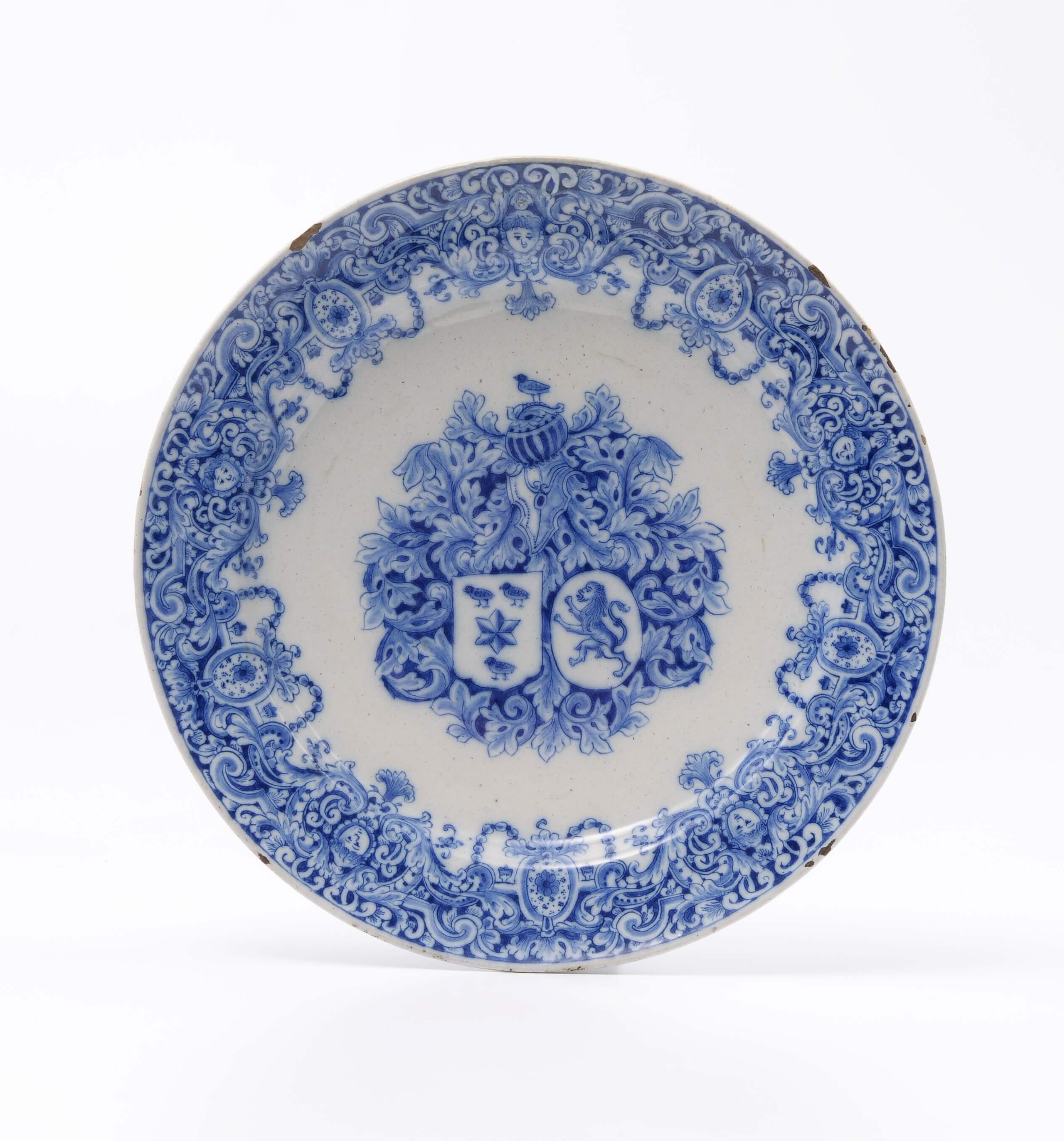
Around 1750, a more rich, royal blue was seen in Delftware. A beautiful plate in our 2012 collection by De Witte Ster (The White Star) factory from around 1760 illustrates this vibrant blue. The plate is decorated with a broad rim of detailed lambrequin-work, and shows a coat of arms in the centre.
The years before 1770 represent the last great period of Delftware production. The decorative and utilitarian wares produced during this period are characterized by different shades of greyish-blue.[2] A three-story high money box, now in the S. Stodel collection and illustrated in C. Lahaussois, Delfts aardewerk, p. 182, shows the aquarelle-style of decorations of the 1760’s. Only slightly later is a IVDuijn marked tobacco box of circa 1770, previously discussed in our article, The Dutch Raid for Exotic Treasures, Such As Tobacco. The box is finely decorated with geometric patterns and small scroll work. Typical for objects made after 1770, the color is precisely applied on the tobacco box in only one or two quite strong shades, rather than patches of color with graduations in saturation and a stark outline.
The founding of a large cobalt ore mining complex at Åmot, in Modum, Norway, caused a large increase of the available cobalt pigment. The unique cultural landscape was formed by the miners who dug out millions of tonnes of stone from the mountain, where the mines stretched for three kilometres from north to south. Blaafarveværket was founded in 1772, and its 2000 employees mined cobalt ore and manufactured blue cobalt glass (smalt) and cobalt blue pigment. At its peak, the works supplied 80 percent of the world market for cobalt pigments. With more cobalt pigments at a lower price, the painters in the Delft factories could use the color more freely, as can be seen in the decorations.
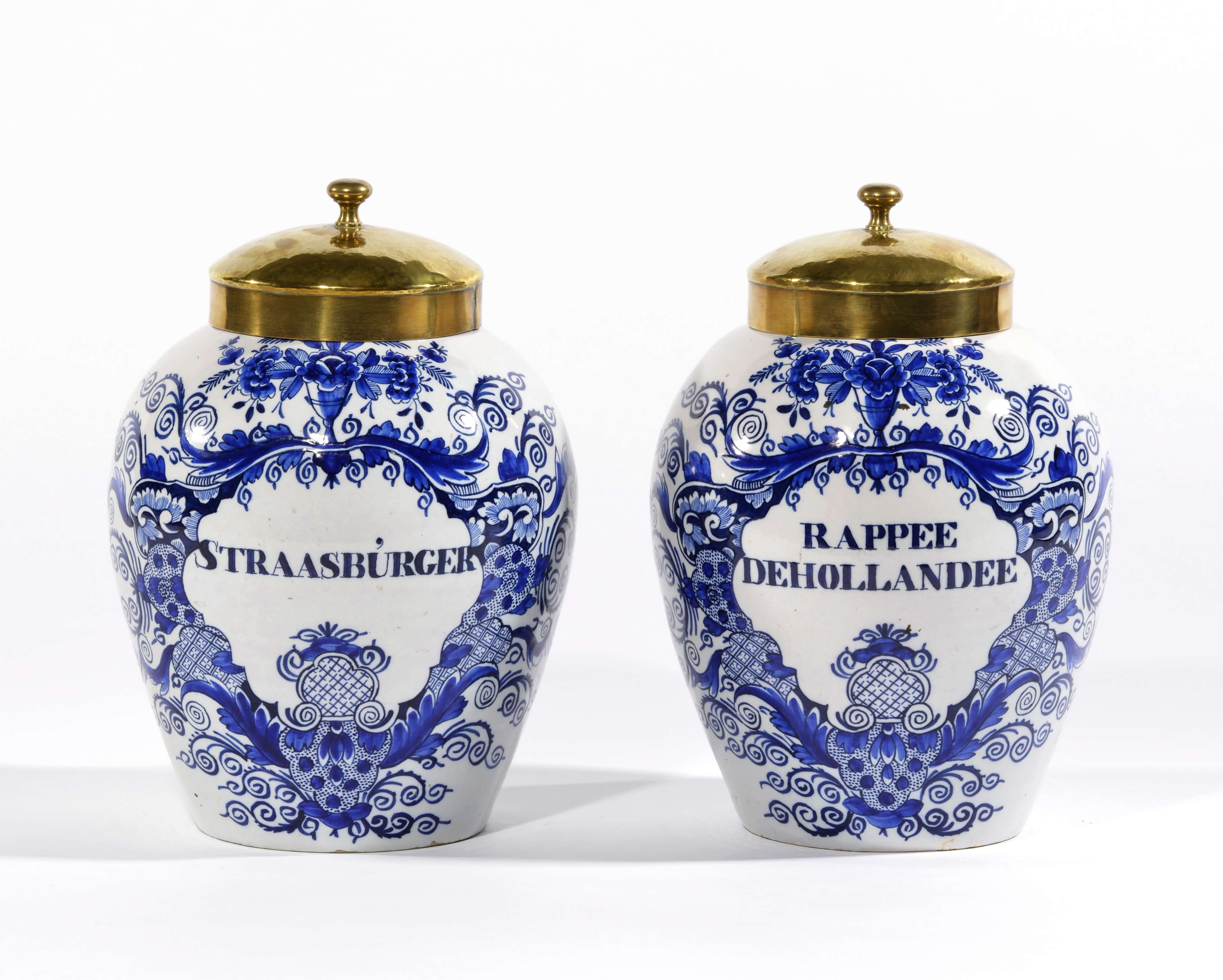
By 1800, objects demonstrate more bold and straightforward painting techniques, using an intense shade of cobalt blue. A familiar design that demonstrates this style are the “pauwstaart”, or peacock tail patterns whose stylized flowers, feathers, and ferns resemble the tail of the exotic bird. The same bold decorations can be found on tobacco jars produced at the end of the century, with large cartouches of scrollwork.
It can truly be said that in Delftware, blue followed the fashions. Beginning as a light lavender, the color intensified at the end of the 17th century and continued to brighten. By the end of the 18th century, a dark shade of blue is seen on Delftware.[3]
Notes
[1] J.D.van Dam, Delffse Porceleyne, Dutch Delftware 1620-1850, Rijksmuseum Amsterdam, Zwolle, 2004, pp. 16-17.
[2] J.D. van Dam 2004 (note 1), pp. 191.
[3] Nevertheless, Dutch Delftware being handwork, the process of painting and firing was a true art, and how the color of blue turned out when the objects were retrieved from the oven depended on many factors.